Iconography Design – Magnificent Merchants
Robert SeibIn games, well-designed icons and symbols are crucial for ease of learning, intuitive gameplay and quick recognition of resources and game elements. Symbols offer benefits (and drawbacks) over blocks of text, especially for repeating and reused concepts.
It's time to design the icons in Magnificent Merchants! Below I'll demonstrate my planning process and then draft some new currency icons.
Planning and Drafting
Video
General Approach
Throughout the game design journey, I quickly throw together symbols and icons for playtesting purposes. They usually are just enough to do the trick but do not have a lot of thought.
Existing Icons
Here is the existing icon set I have been using:
![]()
Problems to Solve
There are problems with them:
- They lack visual appeal.
- They lack consistency across the collection of them.
- Some lack contrast, are are more difficult to identify on various backgrounds and at various distances.
- Some of them have unclear meaning due to being abstract forms with no identifiable or recognizable pattern.
Design Goal #1: Consistency
I want to standardize the icon set to improve consistency and unite the style.
Specifically:
- Contrast
- Depth (this is how 3-dimensionsional something appears)
- Outlining (thickness, etc)
Note, I am not focused on colour right now, that will come later!
Design Goal #2: Recognizability
I want to make icons more easily recognizable.
I can do this by using representative forms – real objects people can quickly identify – instead of abstract forms.
I can also use shape language. Sharp angles convey different meaning than smooth curves.
Design Goal #3: Appeal
They need to look good! I prefer to make games that draw people in with all of their elements including the visual presentation.
Specific Icon Notes
Here are some plans for specific icons in the game:
| Old Icon(s) | Name | Notes |
  
|
Currency | Each type of currency should contain a clear symbol that represents the region. |
|
|
Stamina | Decent shape, but needs more recognition. I might be using a crystal-like physical game piece for these, so I will probably match it to that. |
 
|
City Region and Buyers | The cities on the board map itself should be unique artwork representing each city. But there will still be an icon with the region icon matching the currency. Buyers (hearts) should also match. |
   
|
Sale Items |
Design a decorative box to represent items for sale. For the three types:
|
  
|
Merchant Items |
|
 |
Goals | Too abstract; redesign as scroll to represent quest/goal. |

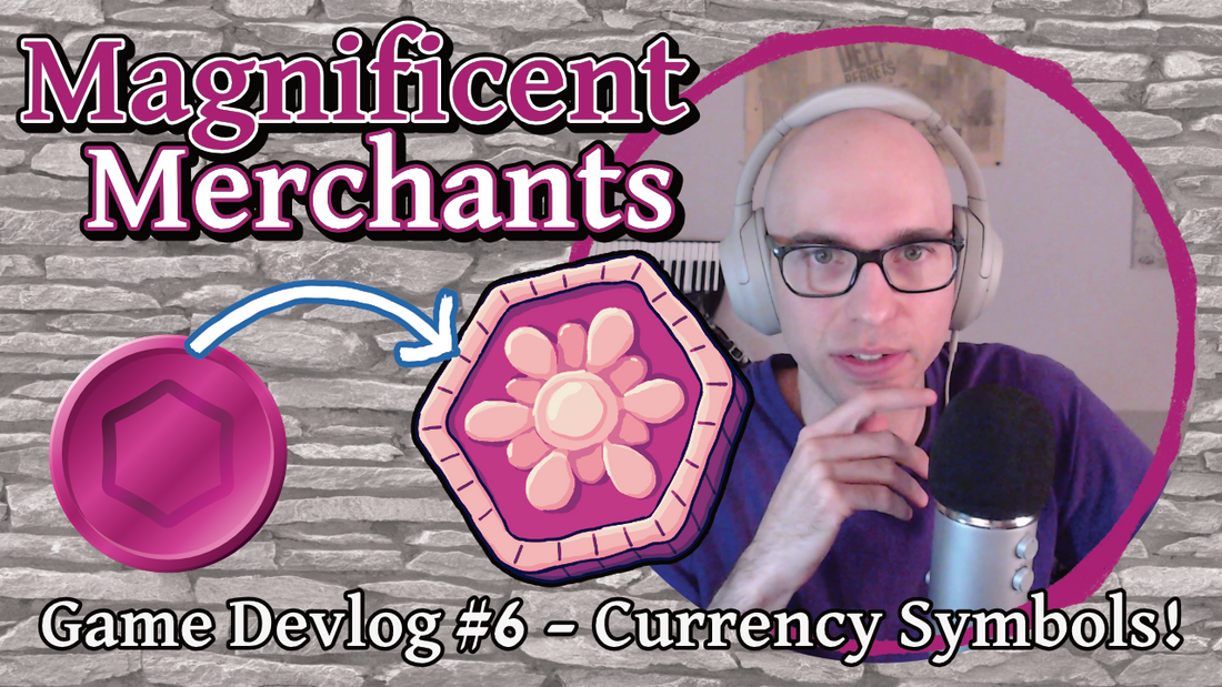
Drafting Currency Icons
Money is an important part of the game, albeit less important than Influence or the Merchants' precious limited Stamina. There are three currencies in the game and they may be exchanged at rates that change throughout the game.
The design is not finalized but I now have a bit of a template or pattern to work with going forward.
You can see the process of creating these in the video.

What's Next?
Watch this space to see how I apply this to the other icons in the game!